
Zwift
An industry-leading platform that transforms indoor fitness into an interactive adventure, blending cycling, running, and training with gamified worlds and a global community.
Zwift was facing a significant challenge
New users struggled to get started. The onboarding process had significant drop-off points, from confusion about how Zwift worked to difficulties setting up hardware, and knowing what to do when they got on the platform.
Overview
As the Lead Product Designer overseeing the Zwift Home Screen Redesign, my role was to guide the team in addressing a multifaceted challenge: modernizing the user experience to drive engagement, streamline navigation, and increase subscriptions. This project required aligning cross-functional teams, managing competing priorities, and ensuring that our design solutions balanced user needs with business objectives.
Problem Statement
The legacy home screen struggled to meet the needs of both new and experienced users:
For New Users: It was overwhelming and unclear, leading to frustration and slower adoption.
For Experienced Users: The interface hindered quick access to activities, discouraging engagement with Zwift’s broader social and live features.
From a business perspective, the outdated design directly impacted retention, subscription rates, and activity participation—key performance metrics for Zwift’s growth.
Role
Strategic Alignment: I worked closely with stakeholders, including product managers, engineers, and C-suite leaders, to align on project goals and define success metrics.
Team Leadership: I guided the design team, ensuring their solutions adhered to user needs while meeting technical and business constraints.
Vision Stewardship: I championed a user-centered approach, emphasizing that the redesign should not only be functional but also emotionally engaging.

Zwift Game Home Screen Redesign
The home screen redesign was initiated to address usability challenges and improve user engagement, social activity participation, and subscription conversion rates.
Role: Lead UX Designer
Duration: January 2021 – April 2022
Team: Collaborated with Product Managers, Engineers, Data Analysts, and Visual Designers.
Outcome: Achieved a 100% increase in activities, 15.5 percentage points (pp) improvement in subscription rate, and higher engagement in social and live activities.
Discovery
The goal of the Discovery phase was to achieve consensus on the problems to be solved and desired outcomes. We set out to research the problem space, frame the problem(s) to be solved, and gather enough evidence and initial direction on what to do next.
Initial User Interviews
User research consistently revealed themes of limited time and long preparation for rides. Users often struggle to understand basic activities and features. While they like the game's appearance, overall feelings about the UI and UX are negative.
Organization Priorities
PMs have created success metrics. Convenience, help to join and participate in activities easily. Social Connection, helping players find like other with comparable goals. Reward, how to level up and celebrate progress. Personalization, even if only by surfacing options better, we can make users feel like they can more easily find content relevant to them.
Quantitative Analysis
Analytics have identified the activities and the manner in which those activities are completed that lead to greater user retention and conversion. Collaborated with the data team to analyze activity patterns, time spent on navigation, and engagement metrics.
Stakeholder Interviews
We interviewed 21 stakeholders and partners including six c-suite and founders, across every business function to establish the foundation of the project. The high level vision from the point of view of the strategic cascade.
Qualitative User Research
System Usability Scale (SUS) is a questionnaire to measure usability perception. We surveyed 304 Current Zwifters across our core user segments. Home screen usability scored a solid “C” at 67.5/100, slightly below average.
X-org Partner Collaboration
We talked to 15 partners across the organization to establish the project mission. These insights helped to guide the flow of the entire project, such as business goals against organization priorities, technical constraints, usability problems, and more.
Synthesis
At the start, I was struck by how many users expressed frustration with finding relevant activities and understanding Zwift’s game loop. Through research, we uncovered that new users felt overwhelmed, and even experienced riders struggled with the home screen’s inefficiencies. This clarity helped us define the focus: create an experience where users could confidently start a ride in seconds.
Original Game Homescreen before update

Key User Insights:
Users Need Speed: Both new and experienced users expressed frustration with how long it took to start a ride. Many new users struggled to find relevant activities quickly and often ended up defaulting to solo free rides.
Social Drives Engagement: Users participating in group rides and live events were more likely to stick with Zwift, but discoverability for these activities was low.
Focus on Short Sessions: Analytics showed that 20–30 minute workouts were the most common activity, yet accessing them required several clicks.
Confusion Over Game Loop: New users often researched Zwift’s basic functionality outside the app, indicating a need for clearer guidance.
Stakeholder and Partner Research
I facilitated cross-functional workshops to prioritize features based on user needs and organizational objectives; in addition to Stakeholder Interviews
Business Needs Alignment: Increasing subscription rates was a top priority, and stakeholders emphasized reducing churn during trial periods.
Technical Constraints: The solution needed to work seamlessly across platforms, including desktops, mobile devices, and Apple TV, which influenced modular design decisions.
Long-Term Vision: Stakeholders wanted a foundation for personalization to scale with future updates.
Product Design Brief
As Lead it was crucial to have alignment before ideation began. On most project I create a Product Design Brief. This brief consolidates our insights, defines the problem clearly, and aligns the team on goals and scope.
This document served as the foundation for the design process, ensuring that every decision addressed both user pain points and business objectives. It is a single source of truth for the team, organizing findings into actionable insights and providing a framework for collaboration. It ensured that user needs, business goals, and technical constraints were balanced throughout the project.
From the brief….
Goals
Reduce time to start an appropriate ride. Enables users to get riding quickly and confidently, prioritize what they can do now; rather than future planning. Update the look of the home screen to reflect a ‘fun is fast’ experience, with efficient direction to new content or notable system updates in a fresh, exciting way.
Increase new Zwifters social activity participation. Surface planned activities, increase participation in social activities, and help players efficiently discover what they will want to do, based on findings gathered through UXR and the Analytics team.
Build layouts for controller-friendly cross-platform navigation. Integral to the redesign is foundational design that allows for easier navigation w/controllers/ATV remote, on a grid, with modularized content to more easily test what content converts at higher rates.
A universal Zwift Design System, to create visual continuity appropriate to platform/media across all touchpoints and channels.
Product Experience Principles
Guidelines to base decisions on through concept iteration or when engaging partners and stakeholders.
● Make systems flexible so novices and experts can choose to do more or less. Avoid jargon.
● Drive focus by keeping interactions simple. Don’t interrupt or give users obstacles—make obvious pathways that offer an easy ride.
● Offer relevant options. Don’t hinder users with nice-to-haves or disabled states; allow them to navigate to needed alternatives instead.
● Fast is fun. Reduce distractions—let users perform tasks consecutively, not simultaneously.
● Focus on emotion—the pleasure of use is as vital as ease of use; delight the user to increase engagement.
Ideation
Initial Sketch Concepts
We brainstormed four initial concepts focusing on key user needs: quick access to activities, social participation, and personalization.
1-Click Navigation: Enabled users to join scheduled events, workouts, or group rides in fewer steps.
Dynamic Cards: Showed personalized content, such as “Next Up in Your Training Plan” or “Upcoming Group Rides.”
Simplified Onboarding: Designed for new users with clear pathways and learning tools.


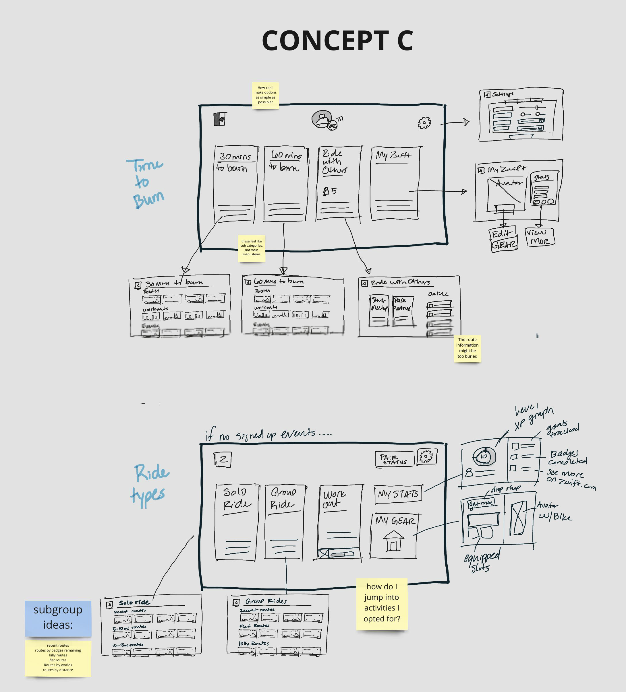

Wireframe Refinement
The rough sketch iterations honed the layout and navigation to make it more intuitive while focusing on fast, direct access to activities.
Users loved the idea of "1-click to start," particularly for workouts and scheduled events.
Many felt the dynamic cards helped reduce cognitive load by surfacing relevant content.


Design Exploration
With the x-organization buyin and positive usability feedback on the high-level concept the team and I started a design exploration process refining the experience.
Exploration Pillars
Fast is Fun: Reduce cognitive load and time to start a ride.
Social Connection: Emphasize group rides and live events to build community engagement.
Scalable Design: Create a modular, cross-platform solution adaptable to future needs.


Rollout Design
Methods:
A/B Testing: Compared the new design with the legacy home screen, measuring key metrics like engagement, activity diversity, and subscription rates.
Survival Analysis: Tracked conversion rates over time to understand the impact of the redesign on subscriptions.
Key Results:
A/B Testing: We tested the redesigned home screen with over 17,000 users. Results showed:
100% increase in activities: Median activities rose from 3 to 6.
15.5 pp increase in subscriptions: Trial users subscribed faster and at higher rates.
11 pp increase in group ride attendance: Social activity participation surged.
6.3 pp decrease in solo rides: Users engaged more with diverse content.
Survival Analysis: The new design significantly accelerated subscription conversion across all time horizons.
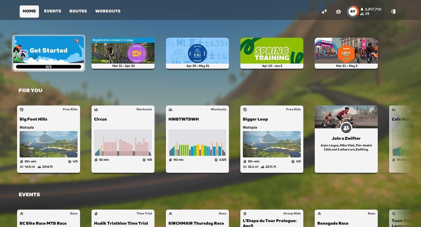
Key Features:
“For You” personalized carousel
Shortcut cards to Group events relevant to the rider
Clear wayfinding and elevated brand experience through updated UI
Streamline navigation to every ride