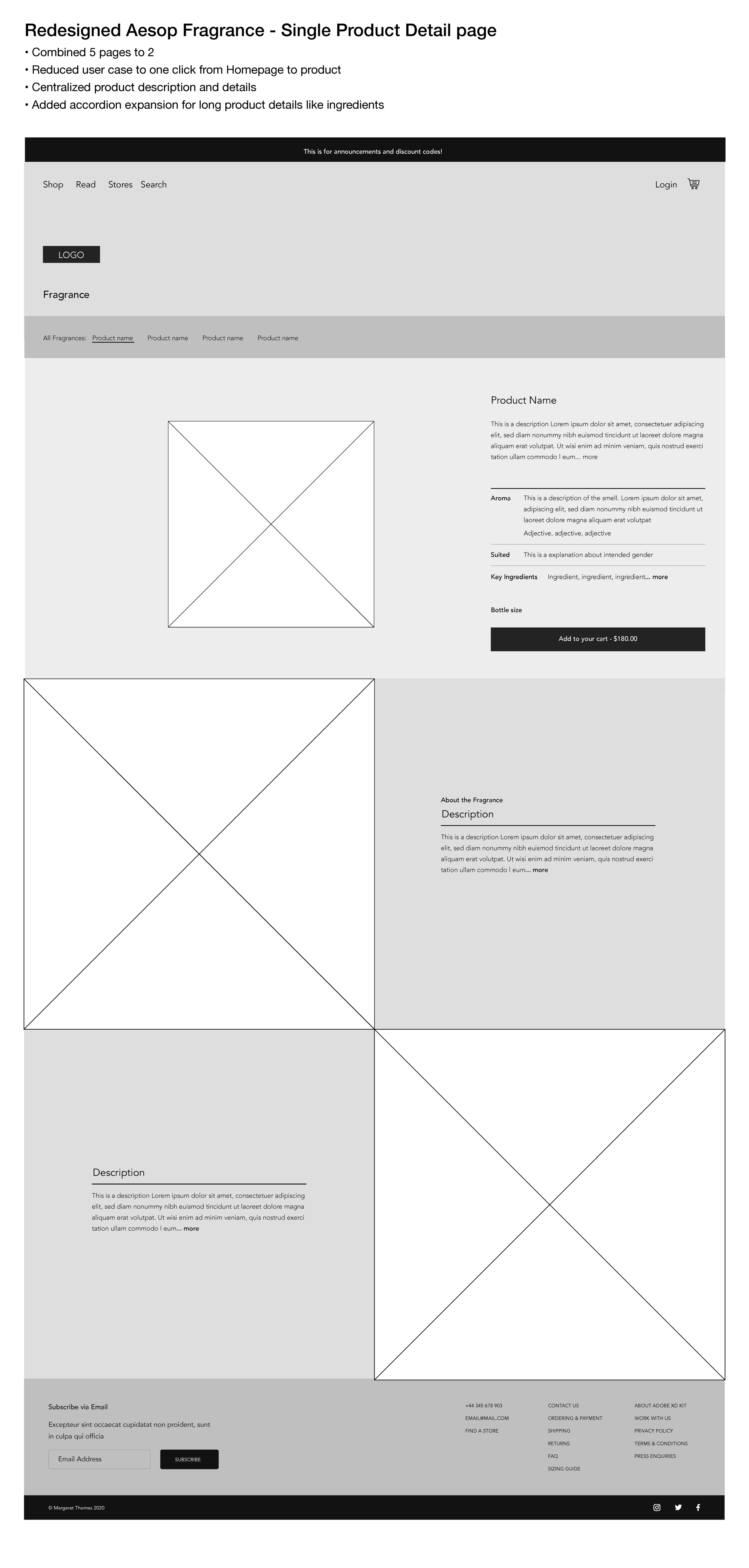
Reduce the Time to Conversion
I started by putting myself in the customer’s shoes and went through the site’s flow in its current state.


I put together a couple wireframes, to illustrate a compressed user experience.

I was recently asked to how I might redesign the Aesop Fragrance site. I put together a summary of my initial thoughts. It’s really important when working with user feedback to read between the lines. All the user feedback pointed toward not being able to find the information customers needed to complete conversion. The user’s commented were lightly veiled implications of friction, too many clicks to add to cart, etc.