Reduce the Time to Conversion
Aesop Fragrance Website Redesign
I started by putting myself in the customer’s shoes and went through the site’s flow in its current state.
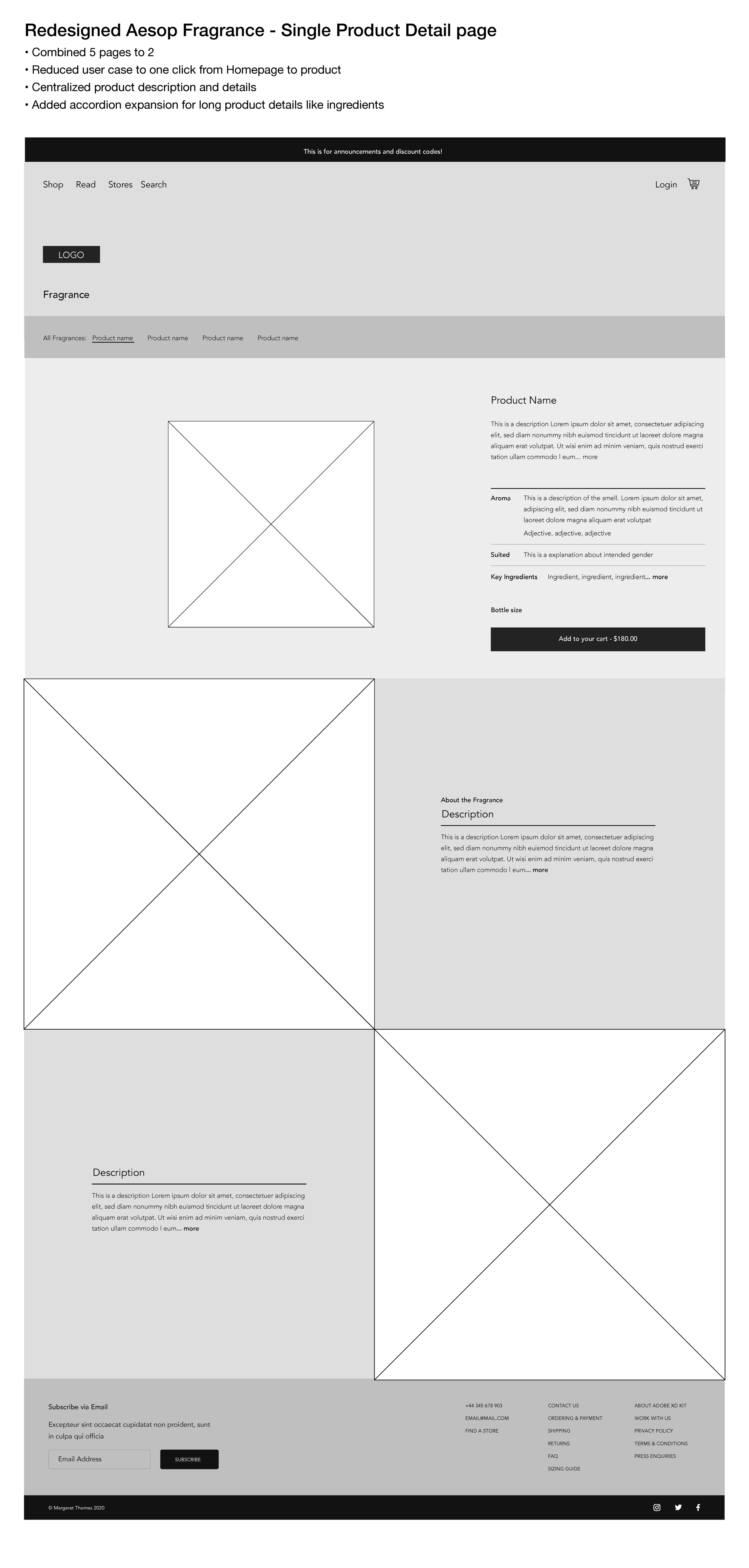
I put together a couple wireframes, to illustrate a compressed user experience.
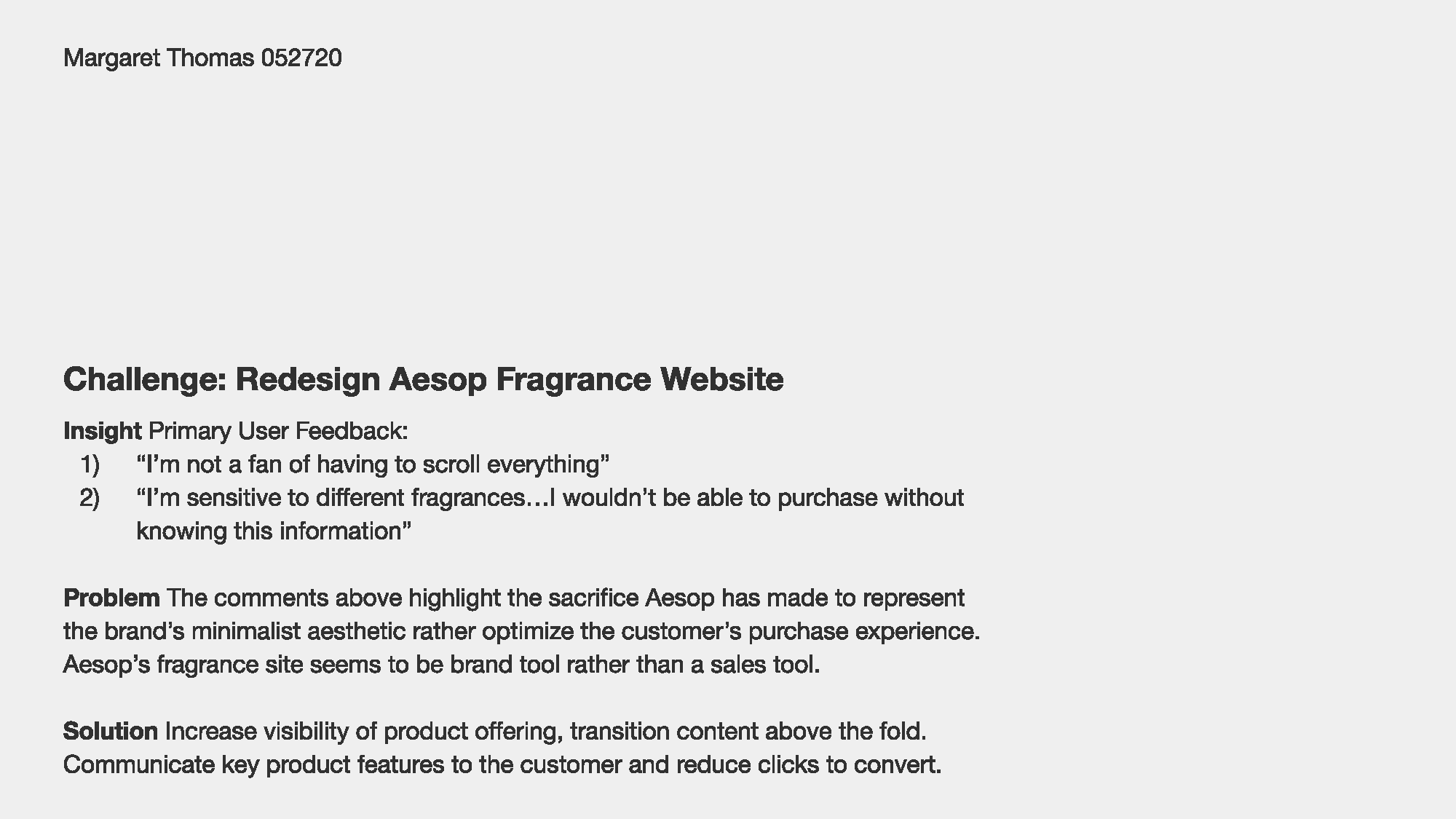
I was recently asked to how I might redesign the Aesop Fragrance site. I put together a summary of my initial thoughts. It’s really important when working with user feedback to read between the lines. All the user feedback pointed toward not being able to find the information customers needed to complete conversion. The user’s commented were lightly veiled implications of friction, too many clicks to add to cart, etc.
Machine Learning Case Study: the perfect coffee bean for you
Machine Learning adds a new tool to human-centered design toolkit. Mastering this tool and understanding it's capabilities opens up a world of services and product types we are only just conceiving of.
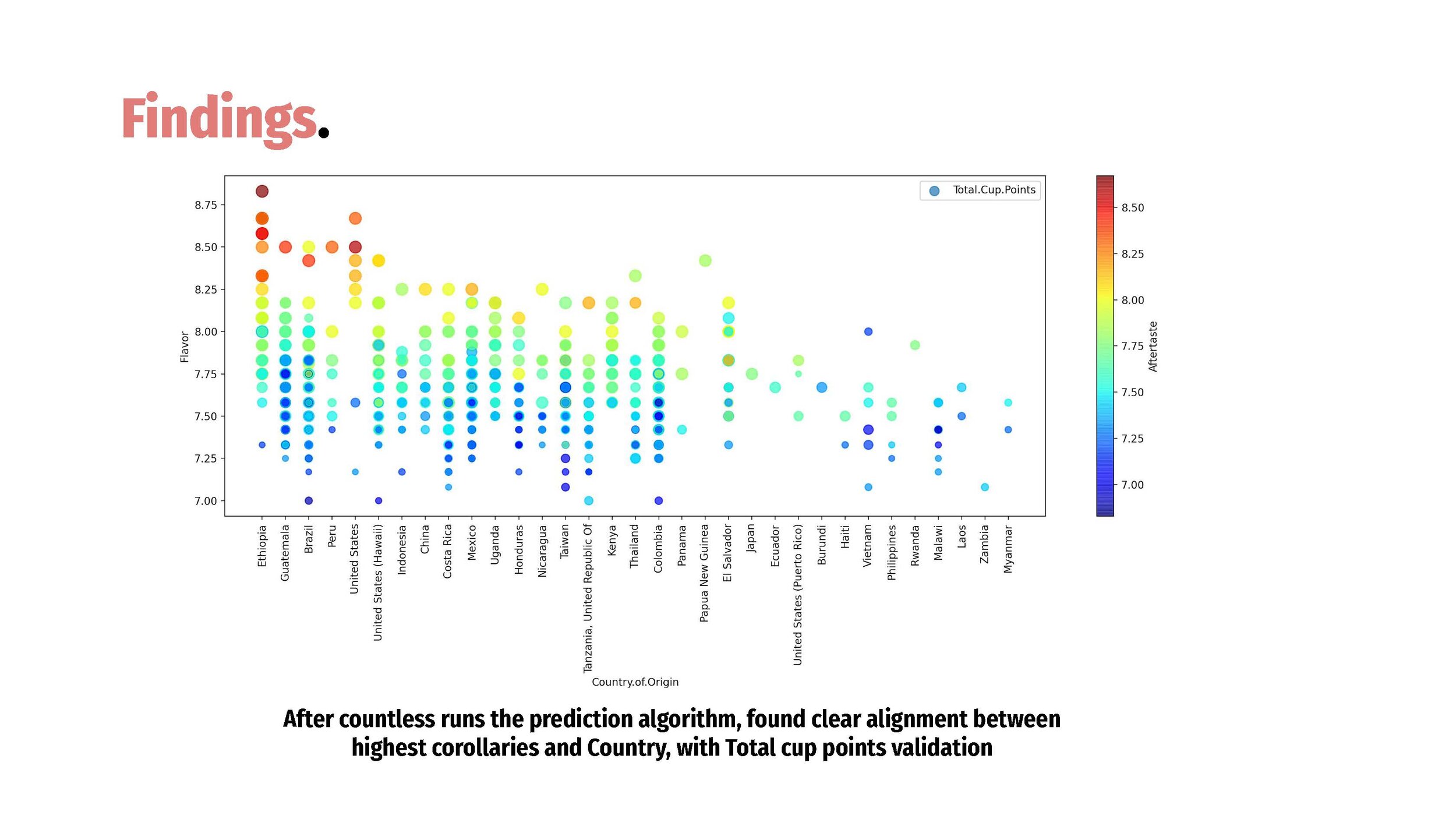
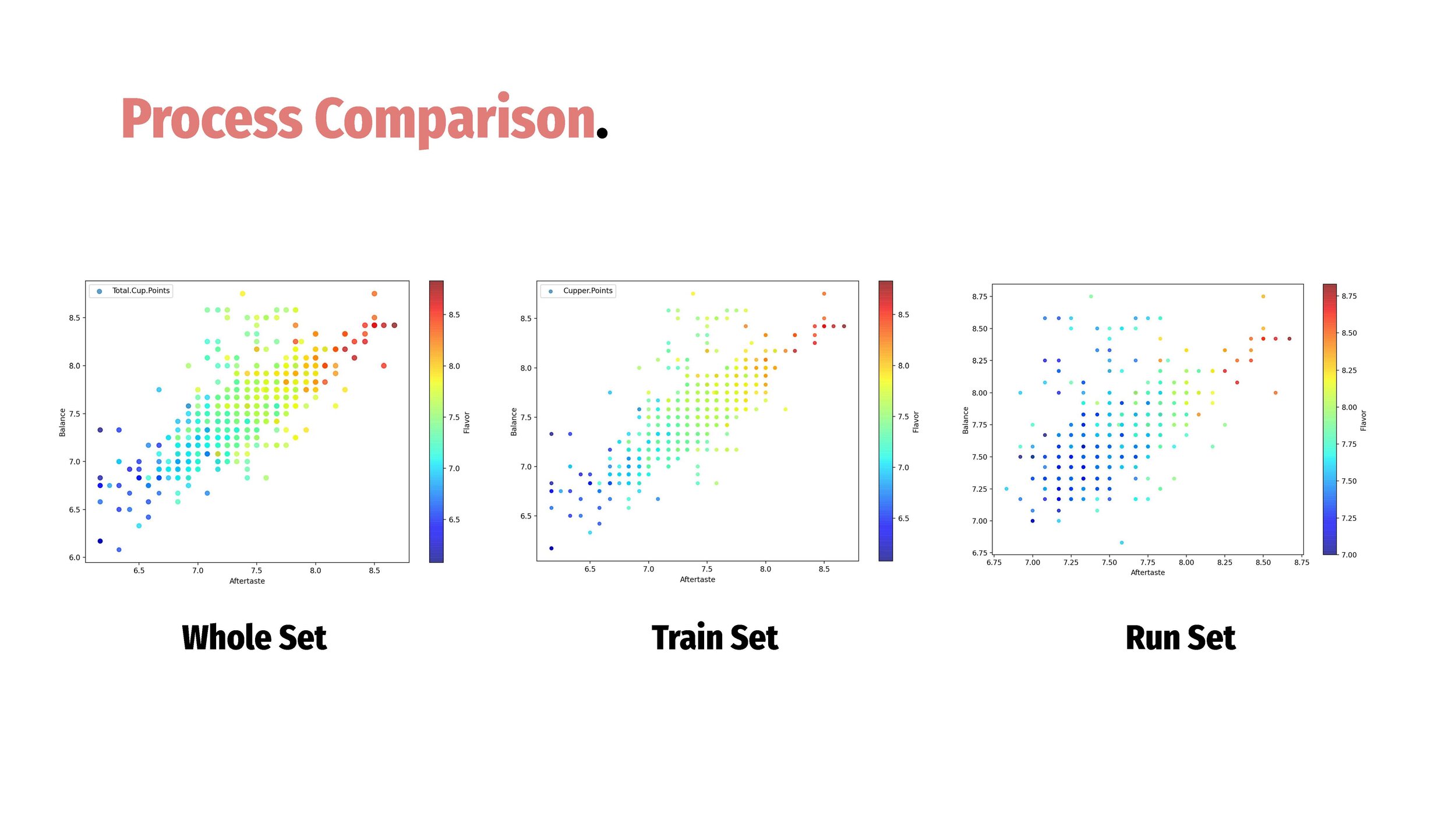
Over the last 2 years I have been working to use machine learning as an additional tool of human centered design. In some ways thinking about the algorithm outcome as a valuable product in itself for the user. This learn I started learning Python and the principles of predictive algorithms to work the initial stages for the Cuppa project. I created a case study to run through the how I decided on the algorithm and the next steps for the project.
You and the Circular Economy
Making sense of the circular economy for everyone
I am finishing my graduate degree at USC this spring. For one of my final projects for last semester I wanted to put into simple terms how the everyday person could participate in the circular economy. I have been trying to understand the industry surrounding recycling and waste management and while i would still struggle to encapsulate all the ills of this side of sustainability. I felt like i could start to suss out what we could do in our everyday lives and how what we could learn more about. Enjoy
Streaming Service UI
Taking a closer look at streaming services UI, there is some bad UX out there.
We’ve all probably been watching more TV than usual during this crazy time. One inconsequential concern that persists is, ‘What show should I watch next’. I have my own thoughts on this but out of curiosity I polled some of my friends to hear how they pick new shows and get some feedback on the streaming user interface.
Some conclusions I came to after hearing the general feedback and taking a close at the leading streaming services UX. First, the show screen could change for a show that has never been viewed to a show that has. The virgin screen could present more like an interactive movie poster, show awards nominations, make sure it is readable from the 10-foot distance, many streaming UI are not accessible for those with aging vision. Always make a trailer available.
Marketing Site Redesign
If you can’t explain your product so people can understand it on a marketing site you may have a bigger problem than a bad marketing site.
This year I worked on a project call Cirqular, you see the case study of the CRM site in process on the portfolio page. When I started working with Cirqular I learned they were updating their website without a designer. They were having trouble communicating with a development team in India. I designed a simple landing page and shared a PDF with the new site design mocked up with India team.
In this process I saw greater potential to use the website as a source for information for all the stakeholders in the waste management lifecycle. Ultimately the website could be a CRM site, but to start it could explain the complex project of building infrastructure for a local circular economy. Because the CEO and the development team in India had wasted so much time forcing an inefficient process I felt that I needed to really quickly supply a solution before digging to the more extensive site. Below is a process image of an early version of the final landing page for cirqular.co feel free to take a look at the final site.
One of the key challenges with the Cirqular stakeholders was communicating to them the importance of reducing the message to quickly understandable idea. In this way we bagan to create a Service blueprint for what they were offering. But it started with the website:


